Release!
Hey everyone!
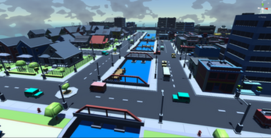
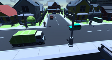
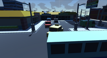
It's a big announcement day, if you've been following this project for the past year (or so) you'll notice a huge difference in the design of the game now than what it was when myself and the dev team went quiet. ALSO, due to the new and continued development we believe that a brand new release for buildscape was in order, to signify the fact we're out of the PROTOTYPE STAGES! AND we're finally hitting the ALPHA stages. So what I'm going to be doing in today's devlog is going over some of the most important changes in this overhaul of the game and going into the decisions the team and I made to decide on that
But before we start I just wanted to give you all our sincerest thanks for supporting us these past few months by giving us feedback on builds of the game and for just sticking with us!
Now...Back to where we were...
UI Overhaul
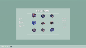
The UI was the biggest sticking point for both lack of functionality and lack of artistic touches within the scope of the entire game. The build menu in the oldest iterations was basic, at best, barely functioning and unpleasant to look at.
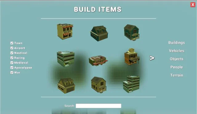
So with great excitement, I'm here to unveil the brand new UI that Buildscape will be using! Its sleek, new and functional approach will allow the players, to finally be able to place things in and around the world without worrying about partial functionality of the UI!
Controls
Control in-game and in the menu was one thing that we decided needed a change, and with our preview game tests. It turned out that you felt the need for it to change as well! Instead of a click, a button press to then be able to place an object. We have decided to drag and drop the object into the world and allow you to change it in the world using keys. Although it will take some more refining will be happening within the coming few weeks
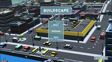
Main Menu
The game's uniformity with the menu's and the title was a big thing with me personally, so I decided a bit of a UI rework was in order. The text in the main menu was all over the place and it needed some uniformity! So after many tests of it, I am finally happy with how it looks. If you find any issues with it please let us know through our discord server!
New Items!!
After the last release we decided to expand our asset list, we've added an extra category under the "War" tag in the build menu, check it out and let us know what you think in our discord!
Files
Get Buildscape
Buildscape
Buildscape is the Ultimate Sandbox Experience
| Status | In development |
| Author | JosephGames |
| Genre | Simulation |
| Tags | 3D, Endless, Low-poly, Non violent, Sandbox, Unity |
More posts
- 2023 Update 1st updateJan 25, 2023
Leave a comment
Log in with itch.io to leave a comment.